by barmy_army008 »
23 Aug 2011 18:40
I emailed the club, basically asking why the decision was made in the first place and if they had ever considered getting some feedback from the fans in response to possible designs.
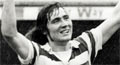
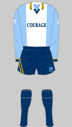
Apparently the plain panel was introduced due to fan feedback (so presumably it has been considered to an extent before...) that numbers and names were difficult to read. Thinking back, we had red numbers for much of the mid/late 90's and early 00's, but I believe there were then 2 or 3 seasons where we changed them to black, and it seems that it was only after this that a plain panel became necessary (the most recent hooped shirt also had black text for some reason). Which would suggest to me that it wasn't the hoops per se, but rather having less contrasting colour, that caused the names to be hard to read.
In terms of asking what the fans want, they said that it had been considered but, as has been suggested on here, it is difficult to get a consensus.
So probably nothing groundbreaking in the response, but the fact they're saying it was fan feedback which led to the panel in the first place suggests that maybe alternative feeback would be considered too. Of course, there is always the possibility that more fans prefer it without hoops anyway.